
WE LOVE NYC: Thoughts on NYC's Latest Campaign
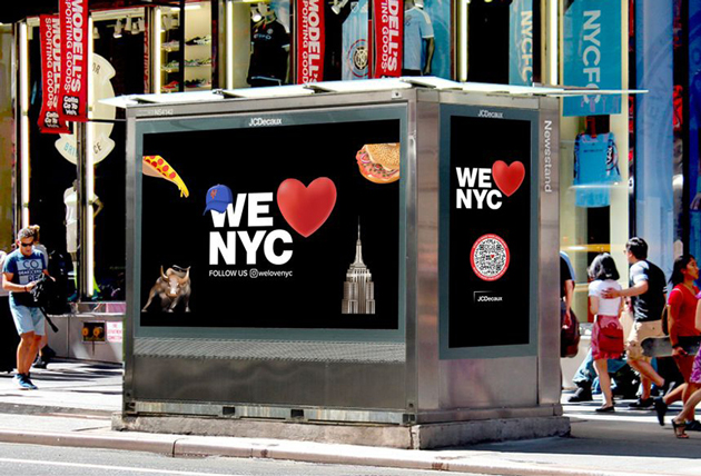
Photo courtesy of We Love NYC/The Partnership for New York City.
Written By: Chase Ayres, Studio Director and Print Manager
NYC recently launched a new ad campaign, “WE LOVE NYC”, with an aim to boost city residents’ hope for the city and to embrace their communities by volunteer action, supporting local businesses and continuing to make the city a great place to live, work and visit.
As a designer living in Brooklyn, my initial reaction was how could they replace the iconic and much loved “I Love NY” logo designed by Milton Glaser and a campaign of New York’s since 1977? It turns out the prior campaign and logo are for tourism and will continue to be used. This new modernized take, while not a tourism campaign per se, is a completely different campaign geared to New Yorkers. Are you confused? So am I.
Did the old logo need to be modernized? Do we need two “LOVE NY” campaigns? Glaser supposedly sketched the original logo while riding in the back of a city taxi in 1976. The typeface he chose was a font that everyone knew at the time, typewriter letters. The rounded serif letters were warm and welcoming, while the simple 2D design made it perfect for reproducing in print.
![]()
Photo courtesy of We Love NYC/The Partnership for New York City.
The “WE LOVE NYC” logo is an homage to the classic. The typeface is changed to an extra bold sans-serif font and the new heart is a 3D emoji style. The designer, Graham Clifford, designed the lettering to resemble subway system signage. The emoji heart can be replaced with other emojis-style graphics that represent the city, ie. a coffee cup, slice of pizza, the Empire State building, etc.
Initially I wasn’t the biggest fan of the new version – the heavy weight of the lettering seems cold and lacks the vibrancy of NYC. And more emojis in our life? Really? However, after seeing the campaign on the digital screens in the subway, I have to say, the changing emojis was enjoyable to watch while waiting on the train. A new take on a classic iconic design is rarely received well initially. Time will tell if it catches on.
Chase is the Studio Director and Print Manager at Herrmann Advertising | Branding | Technology. He resides in Brooklyn, NY.