
A Not-So-Extreme-Makeover
Ways to Revitalize Your Firm's Website Without Hitting the Reset Button.

As we move into the new year, many firms will take this opportunity to review, recommit and reassess their brand needs. As its primary communications hub, a firm’s website will naturally be at the top of any list, and if your firm’s site is a few years old, it’s possible that it no longer effectively meets the current needs of the firm or the expectations of its audiences.
But building a brand new website can be an intimidating project to start, especially with those daunting questions popping up about budgets, timelines, content development, image hunting, UX testing, link redirects and so much more. Oftentimes, however, a less-intensive refresh can effectively extend the life of an existing site by focusing on design, UX and technology updates that can be implemented within the foundation and frameworks that are already in place. Here are a few suggested elements to assess when determining the best opportunities to refresh your current website experience without starting from scratch.
Take a Fresh Look at Your Homepage
Although biography pages may be the most viewed pages in sum for many professional service firm sites, the website’s homepage is typically the single most-viewed page on the site and a firm’s best chance to hook a visitor and take control of the story it wants to tell. Having visually dramatic hero images or videos, clear brand messaging, client successes or testimonials, awards, and new insights or articles are great ways to pique interest while a user scrolls through your website. Making sure this content is up to date will ensure that your site not only “looks” relevant, but that the content itself doesn’t date you. Are your messaging headlines still reflective of the firm’s desired brand positioning and do they feel authentic to who the firm is today (and wants to be moving forward)? Is your hero imagery eye-catching and distinctive, and does it match the theme of the rest of your layout or brand? Are there any old “feature” stories or news that should be removed and replaced with more current ones? Does the firm have any newer stats, case studies or other call-outs to spotlight? Are there opportunities to incorporate images or videos of the people at your firm – maybe connected to news items or featured insights content – to capture more personality and human interest? The answers to these questions can reveal opportunities for enhancements to your existing homepage without a substantial redesign or investment, as these types of updates should be easy for your firm to implement directly through your site’s existing CMS platform.
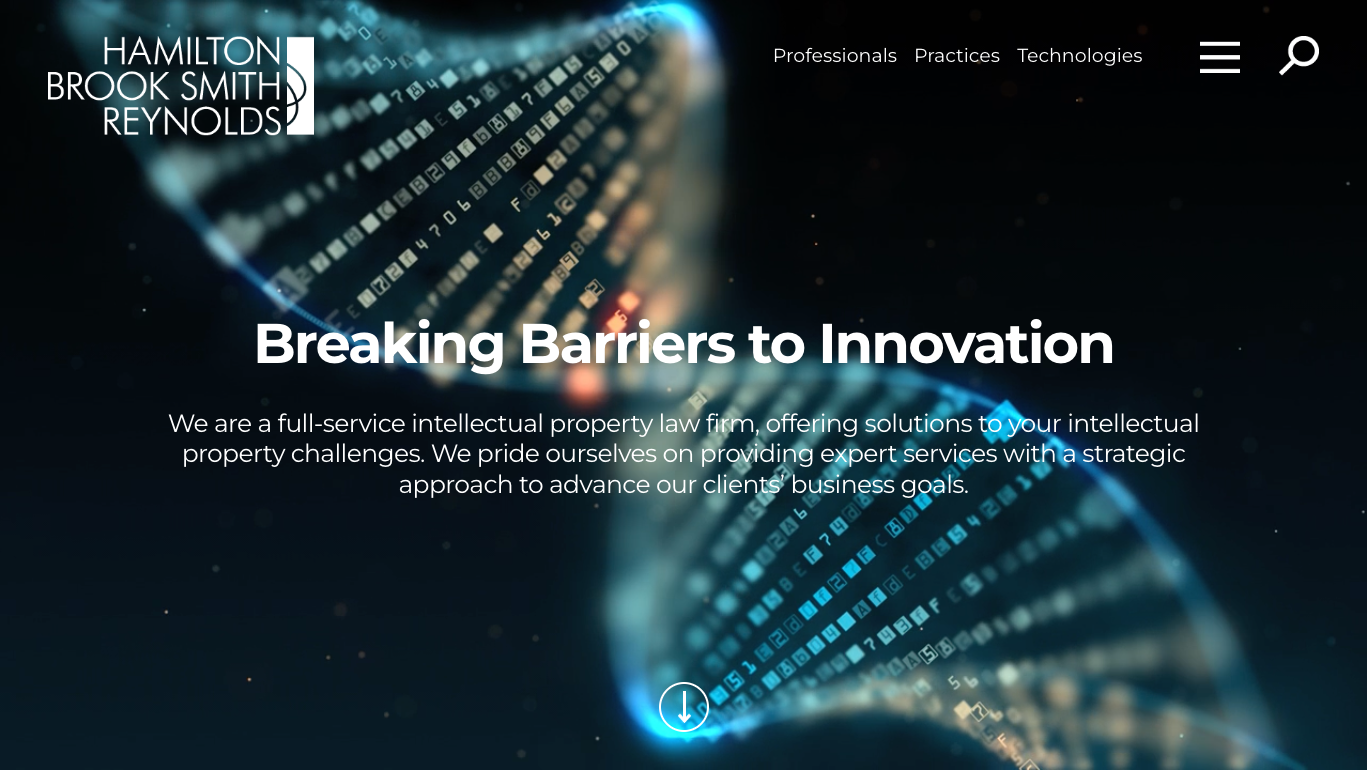 Hamilton Brook Smith Reynolds gives a great example of how to use unique eye-catching video and strong brand messages to give a bold and unique welcome to visitors on the site.
Integrate Micro-Animations and Other Features to Encourage Engagement
Website technology today allows firms to offer more than just a static page with links. If you have any extra-long pages, encourage the user to stay by providing hover animation or collapsible information that will make it less intimidating for a user to read. Have any pullout quotes, stats or company facts fade or build in so that it has a presentation-type feel. Use auto-play functions to call attention to a certain section instead of relying on the user to hit “play.” Implementing micro-animations, scroll animations, loading animations and more are all great ways to create interaction and engagement with users and connect to your brand. These types of animation, although smaller and more subtle, help increase that feeling of reciprocal engagement that a viewer has with your website and inject additional life into your firm’s brand. You can even spice up those basic website features such as loading screens, cursors or even error pages, putting you ahead of the competition in terms of providing an advanced and interesting site.
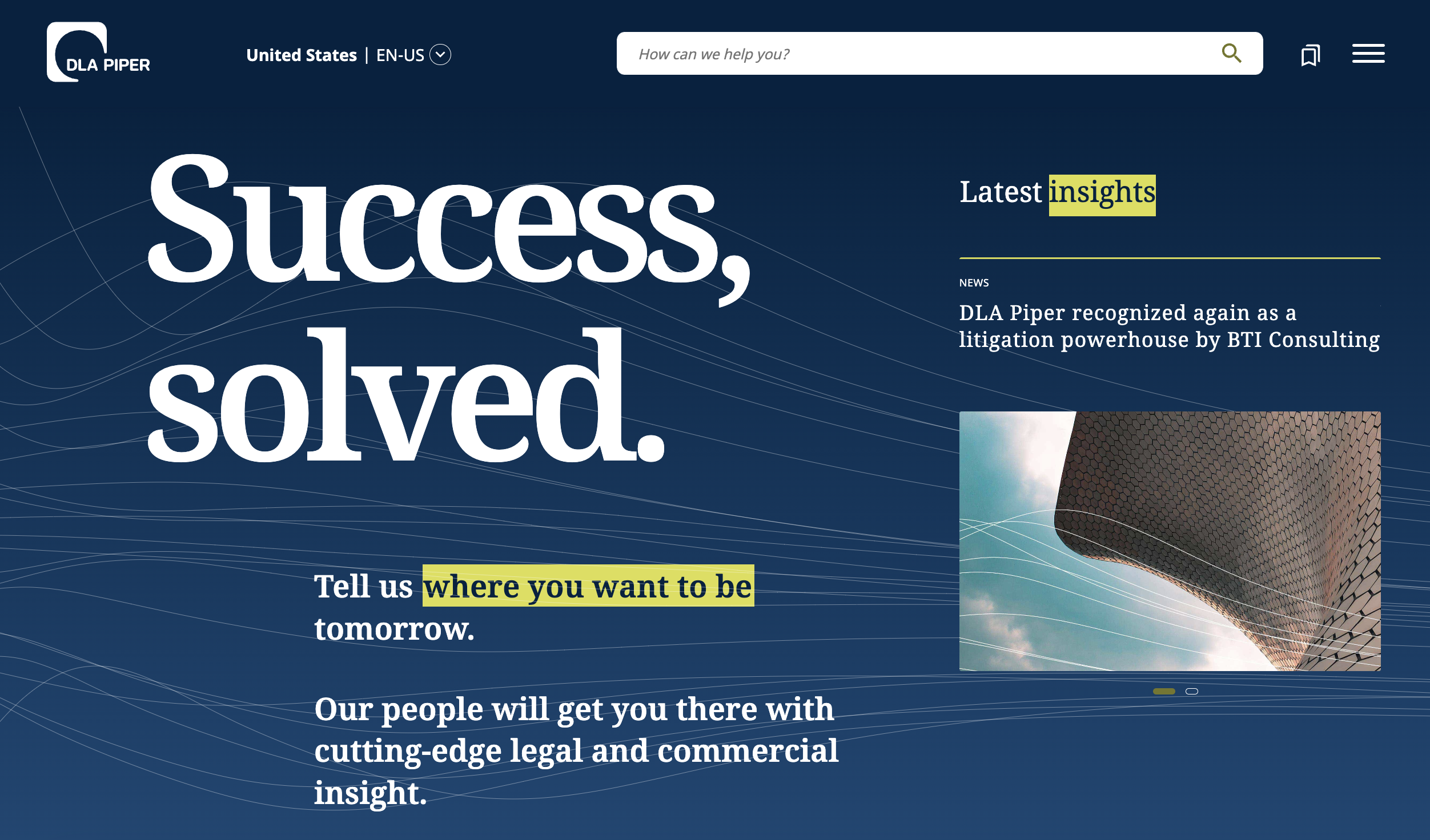 DLA Piper provides a visually interesting slideshow with an animated background and fade-in text, along with other various micro-animations throughout their website.
Build Richer Page Experiences
Keeping a site visually interesting and up-to-date is a key factor in keeping a user’s attention as they navigate through various pages and sections. Oftentimes, users quickly become uninterested or even frustrated when information is hard to find, especially when looking through single, text-only pages with multiple subheadings and no ability to filter out or quickly scan through the content. In this case, building out a richer page experience will not only give the site a more modern feel, but will also give the user the ability to quickly spot, learn or be impacted by the information at hand.
By updating the site’s navigation and information hierarchy you can effectively guide the user along the path that pushes forward key information that the firm wants to spotlight (e.g., moving your Careers link to top-level navigation if you are looking to grow your firm). Have callouts on your homepage for pages or information you desire to spotlight. Increase visual hierarchy by exploring different and bolder font formatting. Having areas for images and icons helps the user find information quickly and breaks up text-heavy content while emphasizing the main points. Using bold callout quotes or stats can replace the need for lengthy paragraphs about your firm and create more visual interest. Using subnavigations at the top of interior pages also helps filter out information that the user wishes to jump to, and even eliminates the need for a longer main navigation while condensing pages. Even simple design elements such as dividers, background patterns and splashes of colors can bring more visual interest and engagement to a page.
In some cases, it may make sense to develop separate microsites to highlight certain information and topics that have become too long for a single page while creating a more interactive user experience with search features, testimonials, information about the lead members and more. Content focused on specific practice groups or industry sectors; a firm's commitment to its diversity, equity and inclusion initiatives; client success stories; or a firm's recruiting efforts could all be prime candidates for a microsite approach or, at a minimum, a richer and more unique layout within the structure of a firm's existing website. Utilizing these modern design elements and functionalities helps create a richer experience for your site and gives it a contemporary feel when compared to a page with a single banner image and basic paragraphs of text below it.
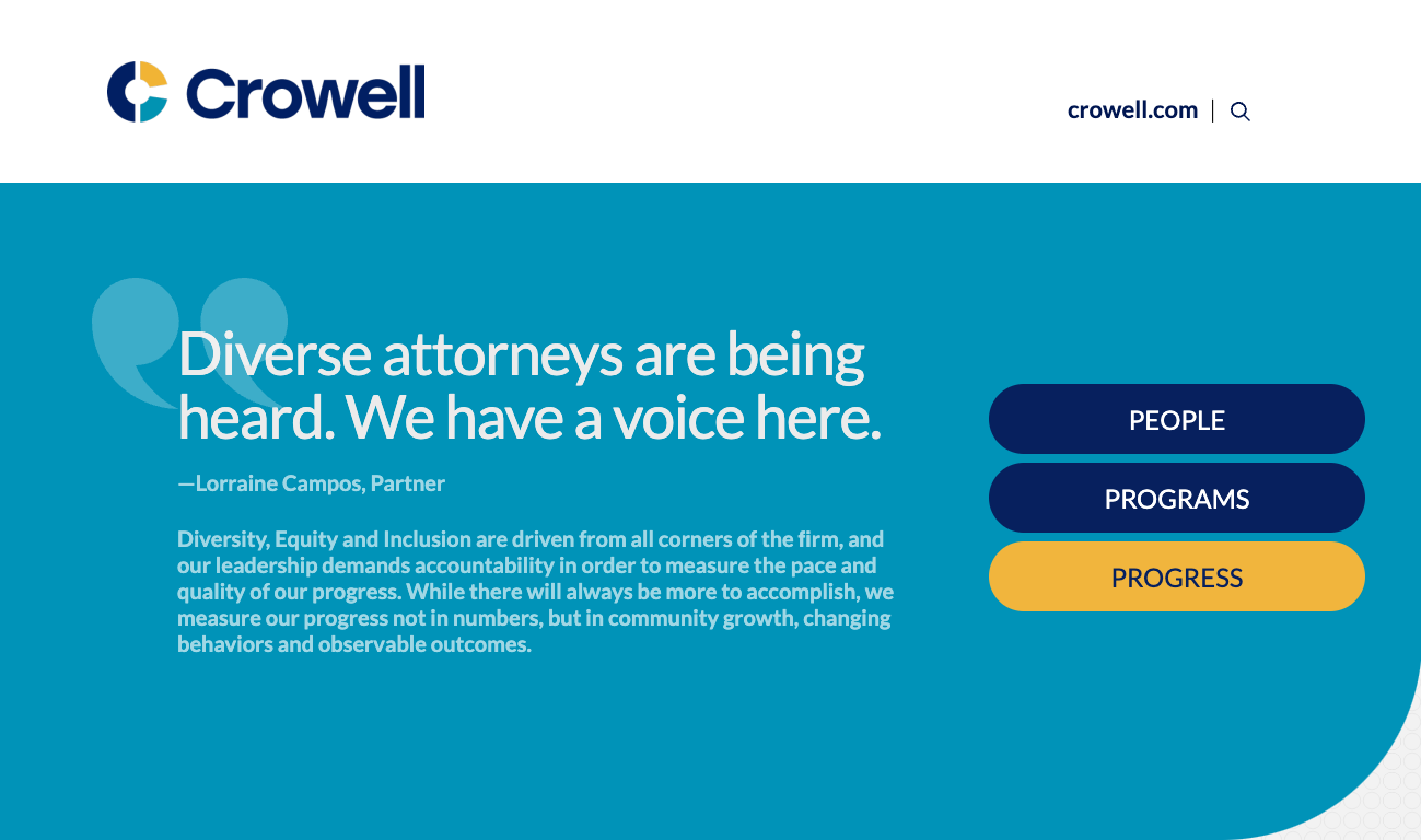 Crowell uses a microsite approach to spotlight its commitment to advancing diversity, equity and inclusion issues within the firm.
Implement ADA Compliance and Data Privacy Standards
Beyond updates to the visual presentation or content strategy of a website, other levels of refreshing your site may require a deeper technical assessment. For example, does your site follow ADA compliance guidelines that would improve the user experience of those with disabilities to better access the information they need? What about when it comes to following the latest privacy and consumer data laws like GDPR and CCPA? Does your site follow the applicable guidelines and have an accurate privacy page or display a cookies preference pop-up? Finally, if your firm does business with international audiences, does your site point to or have a multilanguage feature that would allow non-English speakers to access information in their own language? Whether it is a clearly displayed site translation function or downloadable materials in other languages, is there an effort to remove language barriers on your site? These types of modifications won’t be as obvious to most site visitors as visually-based changes will be; however, they are important in today’s world by making your site accessible and open to many more distinct clients and opportunities.
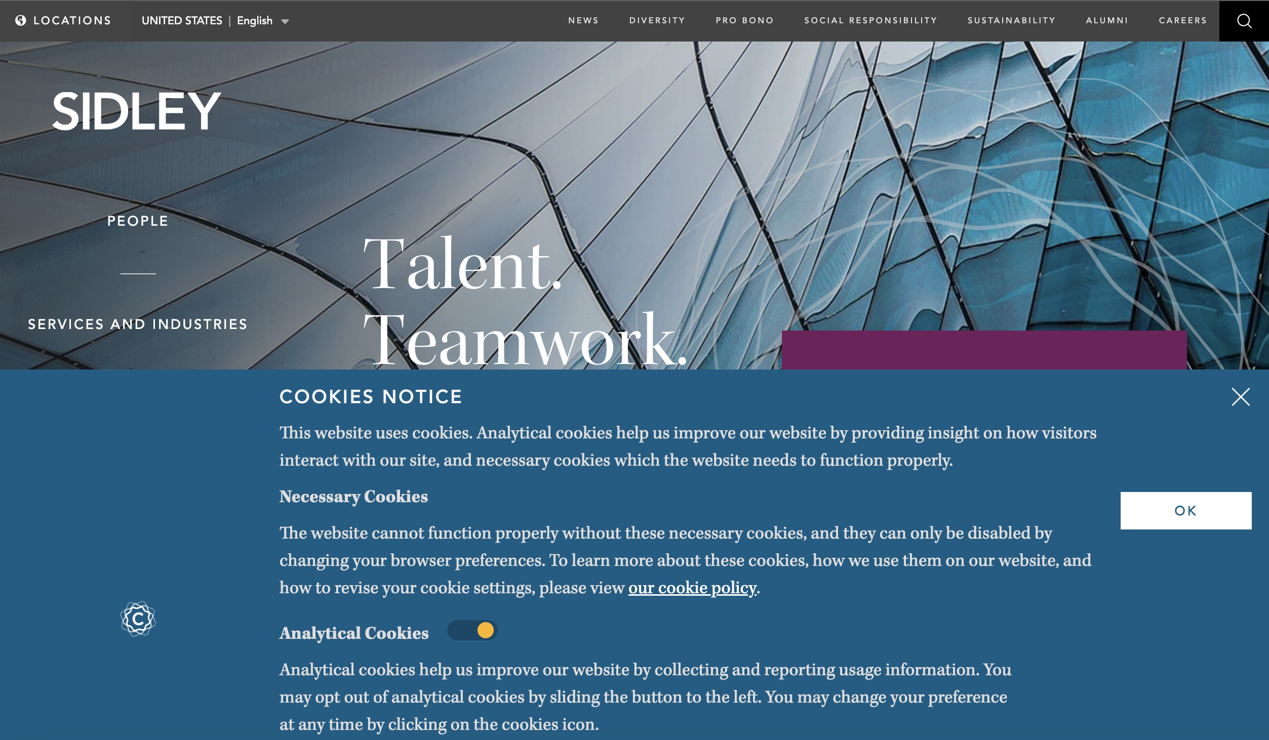 Sidley’s cookies pop-up notifies new users of their cookies policy and allows the user to select their settings. They also include a multi-language feature at the top of their page.
While the turn of the calendar year may come with a renewed interest in updating your website, that doesn’t mean starting from zero. If your site is only a few years old, small adjustments can really make an outsized difference and give your site the boost it needs. By continually and routinely updating and maintaining your site, you can extend its lifespan, put yourself ahead of the competition and create a richer experience for your users.
Does your website need a refresh in the new year? Contact Herrmann’s Chief Business Development Officer John Albert today at john@herrmann.com to see how Herrmann can help.