
5 Ways to Create Memorable Online Brand Experiences
Part 1: Message-Driven Visuals

When any new trends take hold in an industry, the first few early adopters really stand apart from the rest.
Around five years ago, professional services firms started implementing a lot of new design styles and user experience (UX) trends that were, at the time, a big departure from what everyone else was doing. These innovations included mobile-first layouts, minimalist designs, bold imagery, brighter colors, and more engaging content presentation. They were all shiny, new toys to play with.
Eventually though, everybody else latched on to these styles until the once-innovative trends became the industry standards. What had been considered a unique approach became a predictable experience. And that’s where we are now in the industry.
Recognize this pattern?
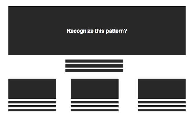
At the top, you would have your main “hero” image – probably a “business scene” of some type.
The firm’s logo is probably up in the top left, while the main navigation is up across the top or perhaps collapsed inside a “hamburger menu” in the top right. Below that, there’s some narrative text that speaks to the firm’s services, capabilities or general approach to business.
And then below that, there are some other content call-outs, sometimes incorporating imagery or other graphics, and encouraging the viewer to click through to the content that the firm wants to highlight.
The rise of these kinds of user interface (UI) patterns means that many websites now look and work in similar ways because users have come to expect certain features and functionality structures. Visitors don’t have the patience to figure out how to interact with a site once they get there. If you try to do anything too out-of-the-box or uncommon, you run the risk of creating a frustrating UX because users expect certain content conventions to be in place. And the main goal of any website should be getting the viewer to the content they’re seeking as quickly as possible.
It's safe to conclude that there are some parameters of web design elements that, while they may be overused, now constitute the bare minimums of providing that expected user experience. So given that reality, what can firms do to still stand out from the crowd in this sea of sameness and create a memorable experience for the user? And how can you create a memorable user experience without sacrificing the expected user experience?
That’s why we have drawn on our 40 years of developing the latest trends in web technology to come up with five tactics that professional services firms can implement to create more memorable and effective websites, while still working within the constraints of current trends and the UX expectations that your audiences have. These tactics are so important that in order to make sure we go into enough depth on each of them, we will be devoting one full blog post to each tactic. Each post is complete with several examples of professional services firms that are already implementing one or more of the tactics on their websites today.
Tactic 1: Message-Driven Visuals
The first of these tactics deals with how firms approach that prominent “hero” image space that so many firms use on their sites.

Customers today seek authenticity from the brands they use, and stock pictures of professionals sitting around a screen or smiling businessmen just won’t cut it anymore. Stock imagery can still have a place, but in order for a brand to really strike a connection with its audience, they’ll need carefully-considered and completely customized visuals which are more representative of who they really are and the specific work they do. This is not to say that stock photography is completely obsolete - it can still be used as an effective engagement tool, as long as it’s done in a way that’s compelling, authentic and supportive of a firm’s overall brand positioning.
Instead of cliché business images, pairing images with specific content pieces can open up the possibilities for more engaging, dramatic and dynamic imagery.
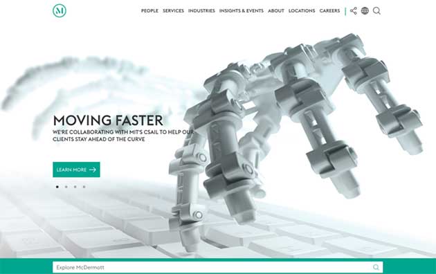
In this example, McDermott uses imagery connected to a specific case study, which captures the user’s attention and leads directly into their content.
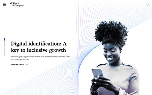
Message-driven imagery can be tied to other types of content and thought leadership pieces throughout a site, like this example from McKinsey & Company:
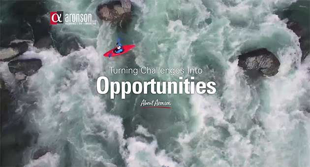
Visuals can also be used to dramatically illustrate company values, as they do for Aronson:
Clearly communicating that brand position is critical. In addition to more unique imagery choices, firms should pair that imagery with authentic, tailored messaging that effectively positions and ideally differentiates the brand.
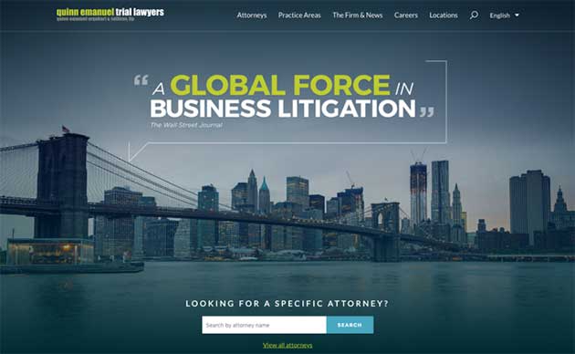
There are several different ways a brand can use messaging to position themselves in the market, but for the purposes of this article, we’ll focus on the two most common. Hard positioning is where a firm explicitly stakes a claim on a specific corner of the market, as Quinn Emanuel has done with business litigation.
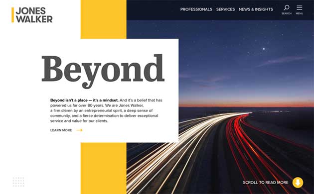
In contrast, soft positioning is more focused on intangible attributes of a firm and the client-benefits they provide, as Jones Walker has done with their abstract message, “Beyond.”
There are advantages and disadvantages to both positioning strategies, and there is no one-size-fits-all solution for all firms. It comes down to the firm’s mission and goals. Regardless of the type of positioning though, a brand’s presentation will instantly become more engaging and memorable if its messaging is clear, concise and authentic.
If your firm is willing to take its visual messaging even further, custom illustrations are fantastic, versatile mediums for creating visuals which are inviting, adds personality, and can be tailored to match the tone of the brand.
Loeb & Loeb, for example, hired an illustrator for their new website redesign to develop a series of custom illustrations that tied into the firm’s “We’re all connected” brand positioning.
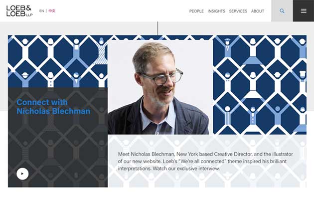
With a unique style of illustration established, brands like Loeb & Loeb are then able to roll that out through their entire identity for use in large header images, custom iconography, and beautifully animated visuals.
Meeting user expectations and presenting an innovative design are not as mutually exclusive as they may seem. Design simplicity and minimalism are still the prevalent trends, but now that so many are doing it, it becomes hard to tell these sites apart from each other. By taking a close look at your firm’s mission and goals, you will be able to strike the unique balance that’s right for your firm and provides a seamless, yet fresh user experience.
Are you ready to distinguish your firm with memorable visual messaging? Contact Herrmann’s Chief Business Development Officer, John Albert, at john@herrmann.com to set up a free consultation today.