
Orange is the New Blue
How is your firm standing out in a sea of blue and navy?

The graphic, fashion, and interior design worlds rethink color several times every year. While that level of diligence may be excessive for law firms, we sometimes ignore this freedom. The apprehension to considering change often comes at a cost. In a society that is in a constant state of reinvention, it is advantageous for law firms to question long-held beliefs about color and reconsider how it is used in their brand identities.
It is commonly accepted that color can evoke feelings and associations. Orange, for example, evokes enthusiasm, creativity and determination while purple represents wealth, royalty and extravagance. However, what a color means is determined as much by culture as by psychology. How do you know if your firm's current color scheme is portraying the right meaning? When is it the right time to refresh your look? How is your firm standing out in an industry that is dominated by blue?
According to a study of 100 top world brands by Marketo, red (33%), blue (29%), and black/gray (28%) each account for almost one third of colors used. For law firms, however, the scales tip even more toward blue, but even the hardest-working color in law biz has its limitations.
How might we expand our perception of color? By reassessing how we interact with color, we learn how to expand our color usage.
Color pairings affect color perception.
If you are determined to have blue in your logo, go for it – but consider pairing the blue with another color, and, in so doing, raising your firm's palette to a new level. Taking this approach will separate you from the crowd of "blue firms" and give your brand's graphics added personality. You might even infuse your visual identity with underlying messaging. For example, if you are an environmental firm, adding green will constantly remind the viewer of the nature of your environmental work and reinforce your brand messaging.
How a color is used can be as important as what color is used.
Of course, some colors and color combinations prompt specific associations. However, there are ways of utilizing time-tested colors and combos to make them your own.
Take red and blue, for example. A color combination that radiates American pride was used by two firms in different ways, making the combination unique to them. Bazelon Less & Feldman, a Philadelphia-based litigation firm, moves their red toward orange, and blue toward blue-green. Council, Baradel, Kosmeri & Nolan, a corporate law firm in Annapolis, also represents a successful mix. In 2013, the firm refreshed its dated look by shortening to the firm's "street name." By moving from maroon to bold red, the new logo stands out against the competition and conveys the firm's energy. The light blue softens the look, again differentiating it from a traditional red, white and blue palette.


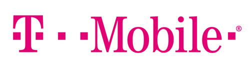
Beyond the legal industry, T-Mobile and its parent company, Deutsche Telekom, boldly defy traditional association of pink with romance, femininity and passiveness. In choosing a deep magenta, they send a message of strength and originality to consumers and differentiate themselves from the competition. A key message T-Mobile further enhanced in the clever and recent Binge On™ campaign and "Restricted Bling" Super Bowl 50 ad. While we don't expect any law firms to begin using pink in their branding anytime soon, this is just another example of how a company can overcome traditional color associations.
It's about more.
There is a current trend toward color fluidity. This color philosophy advances the notion that visual identity needn't be attached to single color, but rather, the palette should remain fluid and flexible. Think Google. While the corporate giant's red, blue, green and yellow selection is its primary palette, shown here, it also expands upon this graphic identity.

Since the beginning of 2016 alone, you may have visited the site and seen any number of these logos.


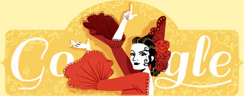


You can view more from 2016 and earlier here.
On the surface this keeps the graphic identity lively and engaging, but on a deeper level, this approach also communicates innovation and confidence. This choice sends a message that Google is a complex enterprise that cannot and will not be defined by its primary colors.
The approach of fluidity takes the pressure off any specific color(s); it's about strategy and reinvention, best suited for firms that spend a considerable amount of capital on brand exposure, and it pushes the rest of us to think about color in new ways. Twenty years ago a firm's capabilities brochure would have been updated every five years, but today, that firm's website content is changing every day. This modern and technologically advanced way of thinking interprets one's graphic identity as an ever-evolving idea.
A bluer blue?
Maybe your firm chose blue as its brand color because your predecessors, whether consciously or unconsciously, wanted to associate the firm with stability, knowledge and depth. Perhaps, like Mark Zuckerberg, your founder was red-green color blind, and blue was the color he or she could see best. Or, blue just seemed like the obvious choice. Maybe your founders chose red because of its boldness, visibility and associations to energy and passion or green because of its association to balance and growth. Perhaps the marketing partner in 1978 just plain hated color, thus explaining why you have an all black logo.
Whatever the origin of your brand color, the more relevant question is: what does your color say about you, and how are you perceived in today's marketplace?
Does your current color successfully communicate who you are in today's highly competitive world? As we are continuously evolving, so too are our perceptions of color. Be mindful of color psychology, but don't be afraid to experiment. Sometimes standing out from the crowd means taking some risks to reap big rewards.
Over the last few decades, Western eyes interpret the color orange well beyond traditional associations of Halloween and traffic cones. And while orange isn't exactly the new blue, it has come a long way.
Orange, anyone?