
Not Everyone is Smiling about Ocean City's New Rebrand
Written By: Chase Ayres, Studio Director and Print Manager
Not Everyone is Smiling about Ocean City’s New Rebrand Ocean City, Maryland recently rolled out their new rebranding campaign, including a new slogan and logo. Having been born and raised in OC, and reflecting on the logos I grew up with – the marlin/ sunset logo and the OC wave logo – I was excited to see what my hometown had come up with for this new campaign.
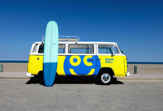
The new slogan is ‘Ocean City: Somewhere to Smile About’ and the new logo is a bright yellow and blue smiley face with the letters “O” and “C” for the eyes. A simplistic emoji-style logo that according to Milwaukee firm BVK, who was awarded the $975,000 contract, is meant to embrace the resort’s carefree lifestyle. Ocean City officials say the new brand highlights all the reasons to pack up the family and hit the beach. Tom Perlozzo, Business and Tourism Development Director for the town, said “The new logo is a universal symbol of happiness and joy. It’s contagious and transcends the language to a positive vibe.”
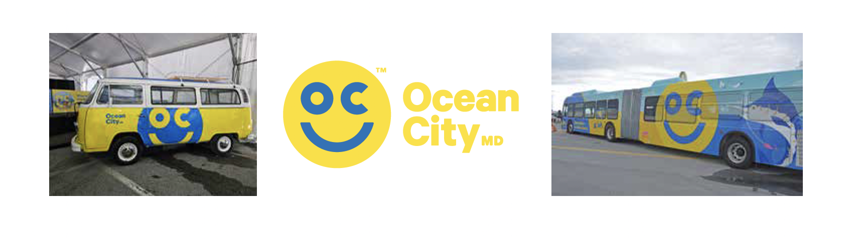
The logo is reminiscent of the famous Have a Nice Day smiley face adorned on t-shirts, coffee mugs and bumper stickers in the 70s. They are even promoting the new campaign using an old-school 1968 VW bus, offering a chance to win a 3-night trip for 2 to Ocean City with a beach van concierge. Promotional pop-ups will target residents in DC, Baltimore and Philadelphia with participants earning keys to redeem prizes.
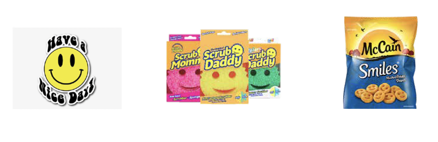
The reaction to the new logo has been mixed with many comparing it to the smiley-face Scrub Daddy® sponges, Walmart’s decades old smile logo and even McCain Potato Smiles®.
 Many people – especially locals – aren’t thrilled with the new design. With comments ranging form “they spent a million dollars on that?” and “It looks like a kid could do it.” to my favorite “It gives off Kraft mac-n-cheese vibes not sand and sea.” However, the simplicity and carefree attitude it represents reflect a fun, beach-vibe. And that is the message city officials hope will resonate with out of town visitors looking to ‘get away from it all’ and chill at the beach. Tourism is the life blood of the resort and potential visitors from regional cities are the market Ocean City needs to make a positive impression upon. Time will tell whether or not it’s effective in that mission, but it already has people talking and that’s the first step in building an effective branding campaign.
I can see this logo adorning t-shirts and hats worn by vacationers strolling the boardwalk, feasting on Thrashers while shopping for souvenirs to bring home to friends. Plus it’s another summer season at the beach – what’s not to smile about. :)
Chase is the Studio Director and Print Manager at Herrmann Advertising | Branding | Technology. He resides in Brooklyn, NY.