
Nostalgia Meets Future: Thoughts on Pepsi's New Brand

Pepsico, Inc.
Written By: Angela Noblett, Senior Graphic Designer
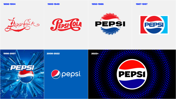
Pepsi has unveiled its first new brand in 14 years to mark its 125th anniversary. The new logo draws from its past while modernizing for the future.
For the past few decades, the Pepsi name has been positioned outside of its globe-inspired icon. And in the most recent iteration (prior to the new brand that was just revealed), the all-lowercase type treatment made the name feel passive or subdued.
 Pepsico, Inc.
In the new logo, the name has returned to front and center, one with the globe. This look is more reminiscent of the 1950-late 90s brands, but with a new, distinctive font that looks modern and bold. There’s an upward slant to the p’s and i that, along with the iconic Pepsi waves, evoke a sense of movement.
This new emblem style with the name centered between the waves will translate well to merchandise, logo gear and signage.
Along with using a bolder typeface, the color palette has been updated as well. The classic red that has remained constant is paired with a deeper electric blue. The new logo will be encircled with pulsing dots in the new blue, which will add dynamic movement and sync with the beats of different music when used in digital formats. Black has been added back into the mix, adding more contrast to the brand palette and commanding attention.
While many rebranding projects choose to completely reinvent the wheel, Pepsi has taken an “old school” approach. Rebranding doesn’t always mean starting from scratch, but rather realigning the visual assets of the company to the current goals and mission it has in place.
So, will Pepsi finally win the cola war? Pepsi is taking a bit of a chance by tapping into its mid-century roots while targeting health-conscious younger consumers with less- or zero-sugar formulas. Will Gen-Z relate to this new look? Speaking as a Gen-Xer, I love it! It’s bold, confident and energized. The unnatural font angles may take some getting used to, but overall, Pepsi has hit the mark this time.
Angela Noblett is a senior designer with Herrmann Advertising | Branding | Technology.