
Matchmaking: Fonts Pairs That Bring Meaning to Your Brand
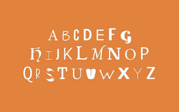
Choosing the right fonts is essential to any brand. It is the one thing, besides your logo and brand colors, that goes into almost every marketing touchpoint your firm will ever produce. And just like logos and colors, fonts can speak a lot about who you are and set a mood for the rest of your branding materials. If you’re a law firm, you’ve most likely been influenced by historical fonts such as Times New Roman, Arial and Helvetica. While these fonts may be simple, easy to read and easy to access, they can oftentimes make your brand materials feel underwhelming and uninteresting.
A brand's fonts usually involve two (or three) font groups: headings and titles (subheadings or subtitles), and body copy or long text. You want to make sure each category is treated differently, and therefore, how you choose your fonts should be influeneced by how they're being used. For example, the body copy should include a font that is easy to read, since it is most likely the smallest text, and the longest text, on your page. Headings, on the other hand, can be much more designed, as they are made to capture a person's attention by offering the most visual interest. Fonts can hugely impact a brand's look, and below we’ve come up with 5 font pairings and styles that are free, simple, and most importantly, bring a refreshing touch of interest to your brand.
Pairing 1: Classic
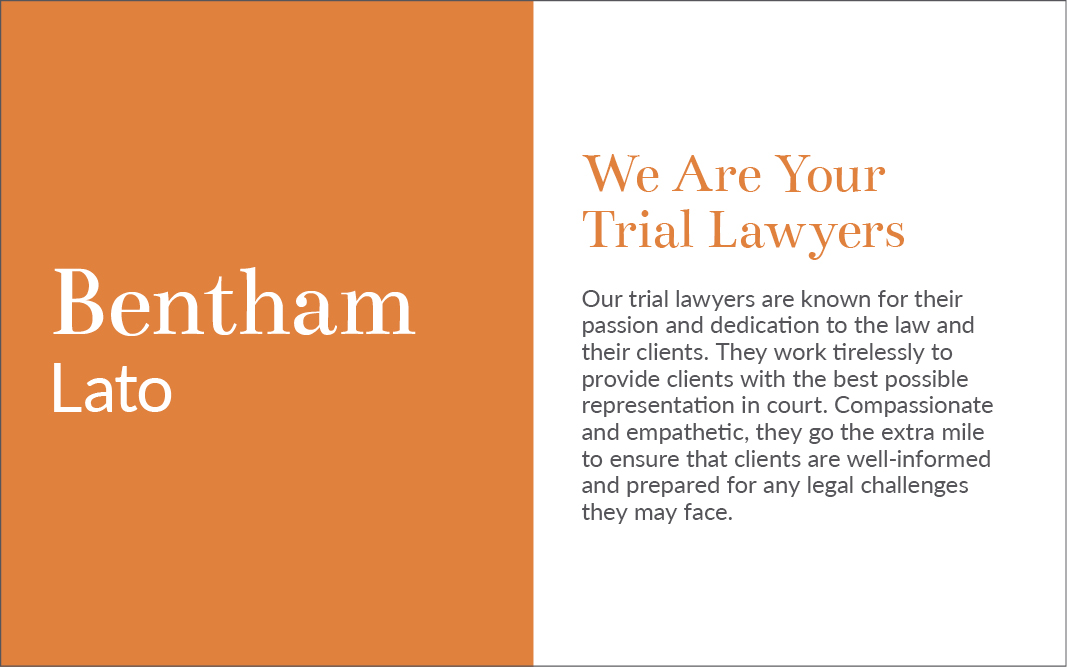
Bentham + Lato
 Download Bentham. Download Lato.
If you are a firm or company that has been around for many decades and holds on to its traditional values and brand, choosing a contemporary serif font may be for you. Bentham is a serif font, but unlike Times New Roman, it holds much more personality in its letters. With a noticeable curvy and organic style, Bentham keeps the serious and sophisticated look of a traditional law firm, but with a much softer and organic application.
To balance this busy heading style, a font like Lato works well. Much like Bentham, Lato is a font that also holds organic properties (meaning, not so linear and geometric), but without serifs. It has smooth curved lines that are easy to read and don't distract a reader. These fonts work well together to project a classic appeal, but also bring a welcoming sense of warmth to your brand.
Pairing 2: Modern
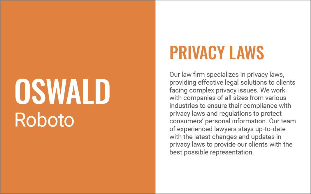
Oswald + Roboto
Download Oswald. Download Roboto.
If keeping up with the times is an important brand position for your firm, you'll want to opt for a font face that is timeless and modern, but not generic. A font like Oswald makes your headlines, subheadings, and even accent features such as buttons on a website, look sleek, clean and contemporary. This condensed font face gives a sleek and strong look to headings without being too extravagant.
To bring a more streamlined balance to this distinguished font, Roboto makes a great companion for the body text. Simple, clean, but not as condensed as Roboto, this font is easy to read on any material, at virtually any size. With very clean and straight lines, both these fonts make for a sleek and modern pairing especially great for digital and web usage.
Pairing 3: Futuristic
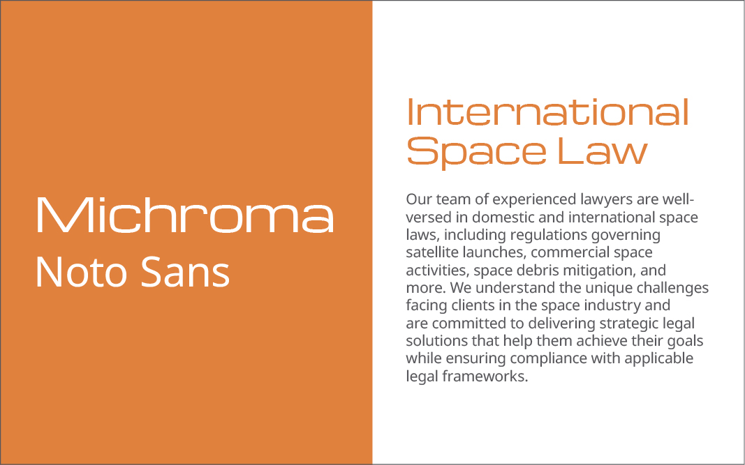
Michroma + Noto Sans
Download Michroma. Download Noto Sans.
Many firms are tapping into innovative industries such as space, green energy and the Metaverse. This can lead many firms to want to capture the future, rather than the past or the present, with their brand visuals and positioning. Michroma is font that uses sharp edges and geometric shapes to establish a sense of futurism. Its wide spacing and clean arches make it seem like it was developed by a mathematician rather than a designer. It is more concerned with being intuitive and intelligent, rather than being soft or warm.
Noto Sans also uses geometric angles and sharp lines, but in a less flashy way. It compliments Michroma in the sense that it grounds the font to current reality, keeping the overall theme futuristic, but in a way that's still accessible. Noto Sans is a balance between round arches and straight lines, making it practical, but with enough personality to stand out on its own.
Pairing 4: Edgy
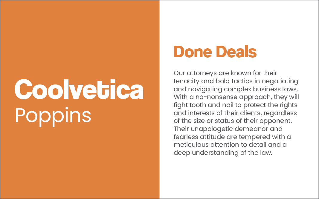
Coolvetica + Poppins
Download Coolvetica. Download Poppins.
If your firm centers itself around being unique at what you do and how you do it, you probably see yourself on the edgier side of your industry. A font like Coolvetica does not fit within streamline practices by any means, but chooses to stand out and be as loud as possible. Coolvetica represents its brand as flamboyant, daring and uncommon. With bold and overly exaggerated curves and loops, Coolvetica aims to say, "look at me!" without trying to be uptight in any way whatsoever.
While on its own this heading may be too edgy for some firms, a font like Poppins strikes just enough balance to bring professionalism to the brand. This round font has a playful personality, but not to the extent that it diminishes the serious nature or tone of matters in writing. Its curvy and circular nature strays from common straight-line fonts and keeps the overall theme edgy, but not chaotic.
Pairing 5: Universal
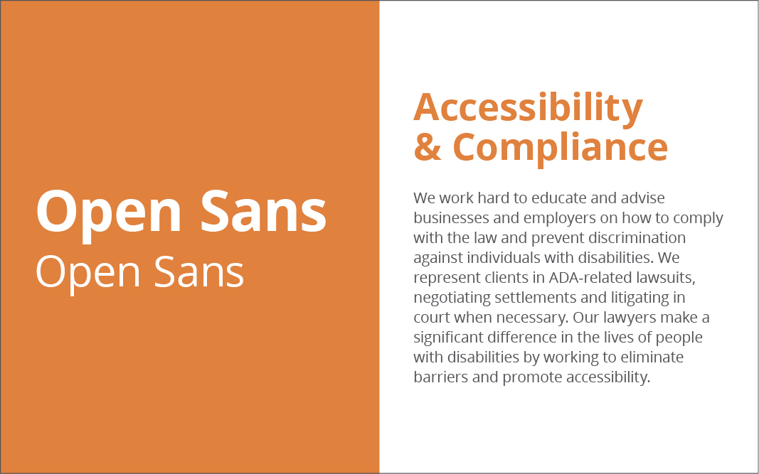
Open Sans Bold + Open Sans Regular
Download Open Sans.
Many firms have a wide audience and therefore need to ensure all of their materials remain universally appealing. While it is impossible to please all, a very straightforward and visually clean font such as Open Sans can keep a brand's target audience as wide as possible. Not too corporate, not too casual. This font is strong enough yet simple enough to make sure headings stay noticeable, but more visually appealing and interesting than a font such as Arial.
When it comes to serving a wide arrange of needs, fonts like Open Sans are highly legible, meaning they work great for ADA compliance. With multiple font weights, ranging from "Light" to "Extrabold," Open Sans carries enough options to use throughout any marketing materials. The humanist, streamlined and friendly feel of this font makes sure all potential clients feel comfortable approaching your firm with their needs.
Fonts do more than just put words on a page. They can establish a mood, style or positioning for your brand. Each font is different and should be carefully thought out when going into your brand materials or brand guidelines. If your brand hasn’t established a brand font, this may lead to some visual confusion, inconsistencies and unprofessionalism across your brand materials. One minute you may be modern, the next classic, and the next futuristic. Colors, logos, styles and messaging are all an important part of your brand, but without the proper fonts, it may all be overshadowed by this often overlooked yet powerful factor.
Need help choosing fonts or building out your brand further? If so, contact our Chief Business Development Officer, John Albert, today at john@herrmann.com to see how Herrmann can help establish your brand.