
Injecting Energy into Liskow's New Brand
![]()
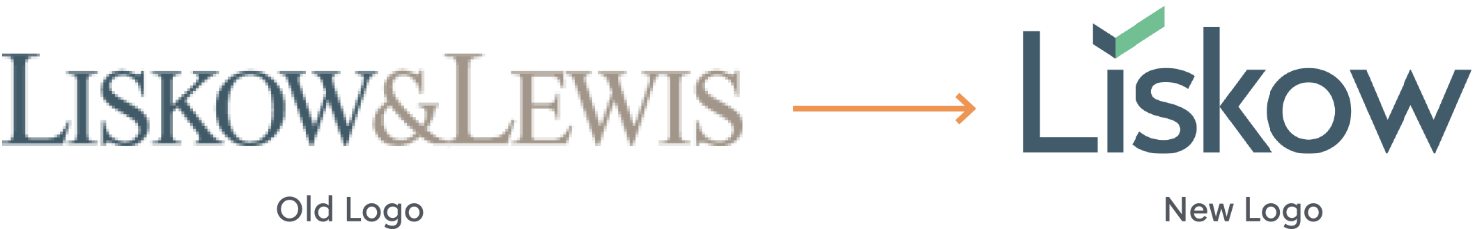
Liskow & Lewis, a full-service law firm located in the Gulf South, was looking to update the visual presentation of its brand. Their old logo and materials were stuck in the past, while the firm was producing leading-edge work in multiple sectors. In addition to shortening the firm’s marketing name to simply “Liskow,” the firm wanted a new logo and brand to effectively capture the energy and spirit they’re known for – both through their people and in the services they provide to clients. The old logo’s serif font and traditional color palette was no longer reflective of their forward-focused vision. They wanted something bold, modern and clean, but still classic, to respect the firm’s nearly 90-year history. And if possible, they wanted an element of forward motion to visually capture how they’re focused on the future, especially in the energy field.
Our Solution
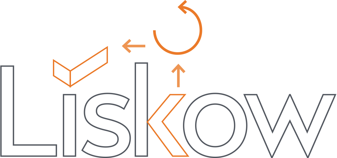
Herrmann’s creative team developed the new logo design with a sans serif font, Radikal, which uses sharp angles. The “i” is accentuated by an angular element, using the same shape taken from the “k.” This icon reflects the forward motion the firm was seeking to capture, and the element has the potential to become a brand marker across various pieces.
After finalizing the logo, Herrmann continued to build out Liskow’s brand through new advertising, internal communications and corporate identity materials. We also put together a brand style guide, to help the firm protect and maintain a consistent, attractive and recognizable brand execution throughout its marketing touchpoints.
Advertising
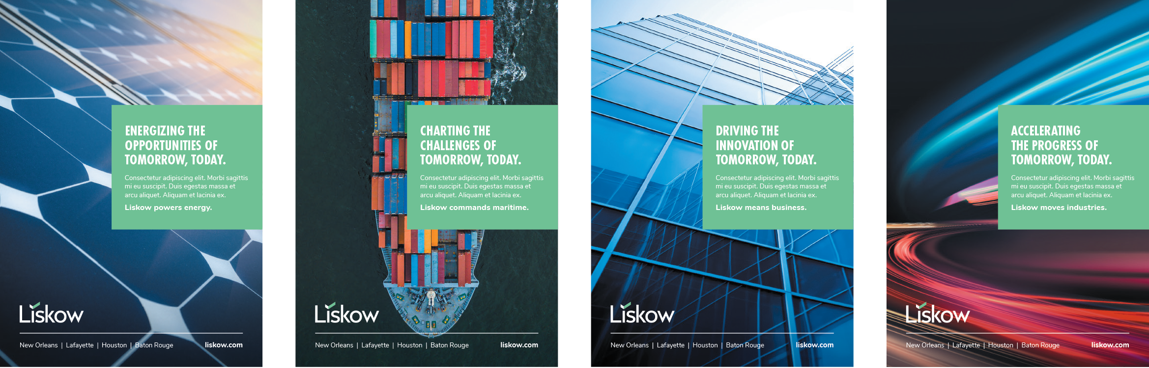
Liskow’s future-focused theme carried into their new advertising campaign by incorporating a “tomorrow, today” theme into the messaging and using colorful, vibrant photography with interesting angles or motion.
Color Palette
Working in collaboration with the firm’s web development agency, a bold new color palette was carried through the firm’s logo and other identity materials. Several neutral colors are paired with accents of green, blue and gold to add more energy and life to the brand executions.

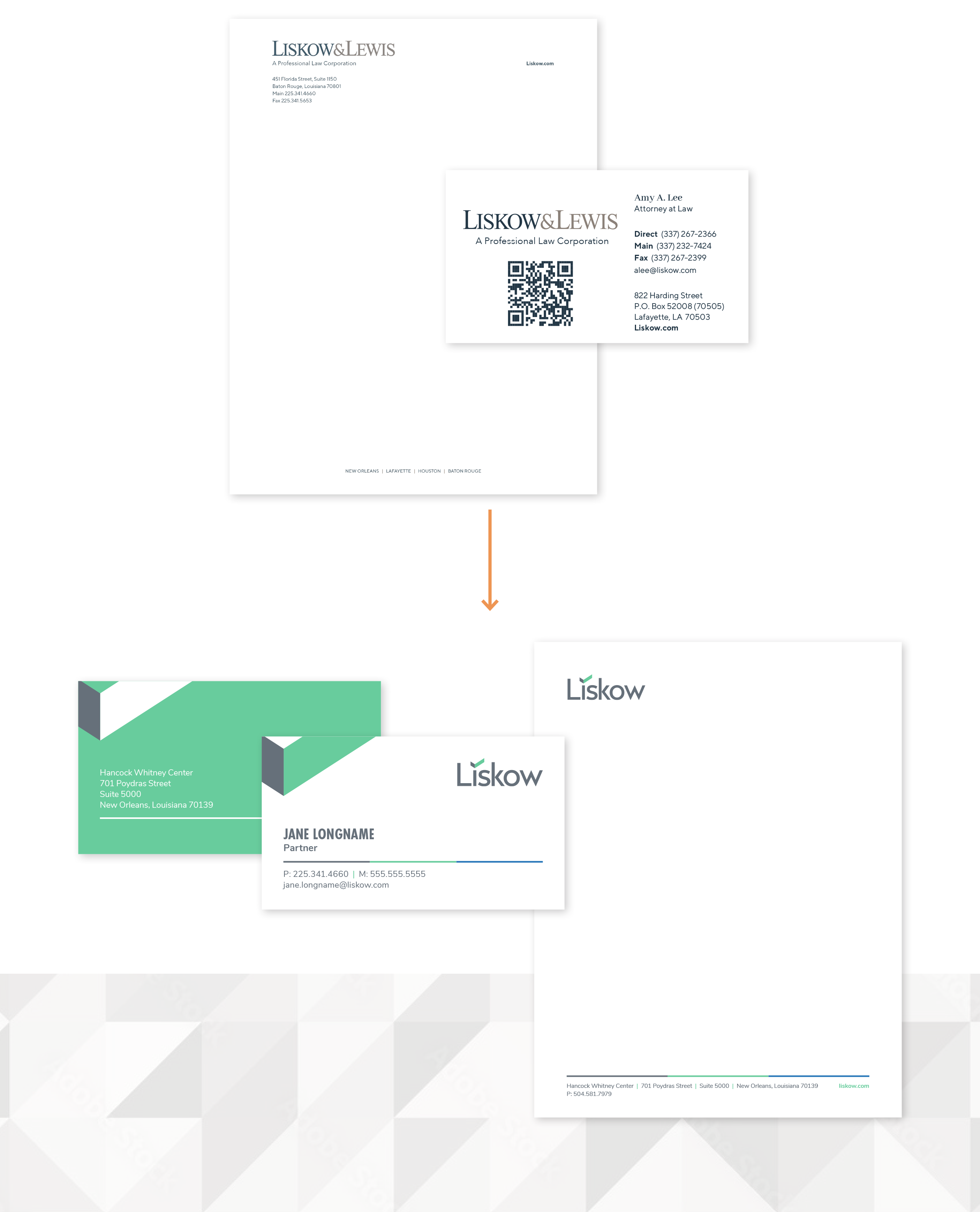
Corporate Identity Package
The logo icon is carried through the business card as a brand marker, while the 3-color horizontal bar on the letterhead matches the website design. The business card feels energized with its bold, green back.
"As our clients across all industries undergo significant evolutions in their businesses, we believe our new brand authentically positions us as a progressive and cutting-edge law firm for all our clients’ needs, now and in the future."—Rachael Schilling, Marketing Director, Liskow
![]()