
Building Flexible Brand Assets
The Need for a Multi-Layout Logo Suite

A logo: the most important part of your brand and identity that can either launch you forward or hold you back. A logo is the visual asset that defines your company name, vision, mission, style and identity all in just a few symbols. Most established companies already have a logo that they worked hard to develop to make sure it best represents the company's standards and goals. A good logo should evolve with the times and stay relevant to the current market.
However, what many businesses often overlook is the need for a logo suite, not just a single logo. A logo suite includes a variation of sizes and formats of the original logo that will best fit any occasion, media or platform. With branding and marketing evolving to include a wide variety of potential media applications – from small smartwatch screens on people’s wrists to huge billboards in the busy city – it only makes sense that businesses need more than a single logo execution in their brand toolbox. Brand consistency is still important, and a business should designate one logo format as its “primary” logo, but in today’s market, some level of brand flexibility has become necessary as well.
It might seem like a difficult task to develop a logo suite without diluting the overarching brand identity, but with the help of an agency, they can walk through your needs and options to see which logo variations best suit your firm’s marketing needs. Below, we’ve provided some suggestions as to a few variations that should definitely be included in your logo toolbox:
Wide/Horizontal Layout
If your logo is fairly horizontal, you may want to skip this section and head down to the next section, “Narrow Layout (vertical).”
If you have a vertical, square or even circular logo as your “primary logo,” you will definitely want to make the investment towards a wide layout or horizontal logo variation. Often, firms will use the horizontal version of the logo as their primary logo because it’s the most practical ratio for almost any media – website banners, letterheads, business cards, etc. A horizontal logo works to fit within shorter places rather than taking up a lot of space vertically. Having a horizontal logo also works best because it matches the background ratio on these items (being that websites, letterheads or business cards are more rectangular than they are square or circular).
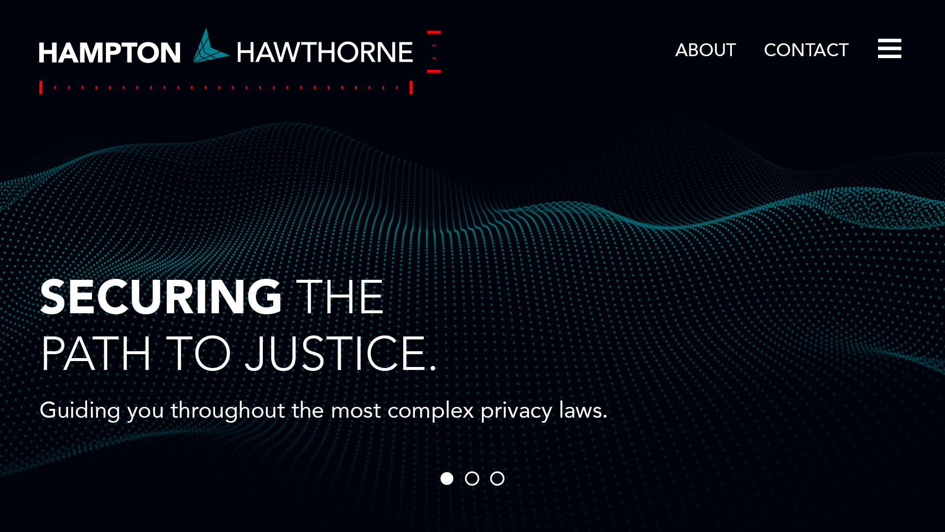 Making sure you have a horizontal version of your logo should be the first step when developing or expanding your logo suite.
Narrow/Vertical Layout
Narrow, vertical or even “stacked” logos try to condense the horizontal logo variation as much as possible. While most marketing materials will use the horizontal variation of your logo, every so often there isn’t much space for such a wide logo. This might include digital ads, mobile-view websites or tall banners. Here is an example of how you want to condense your logo to be narrower:
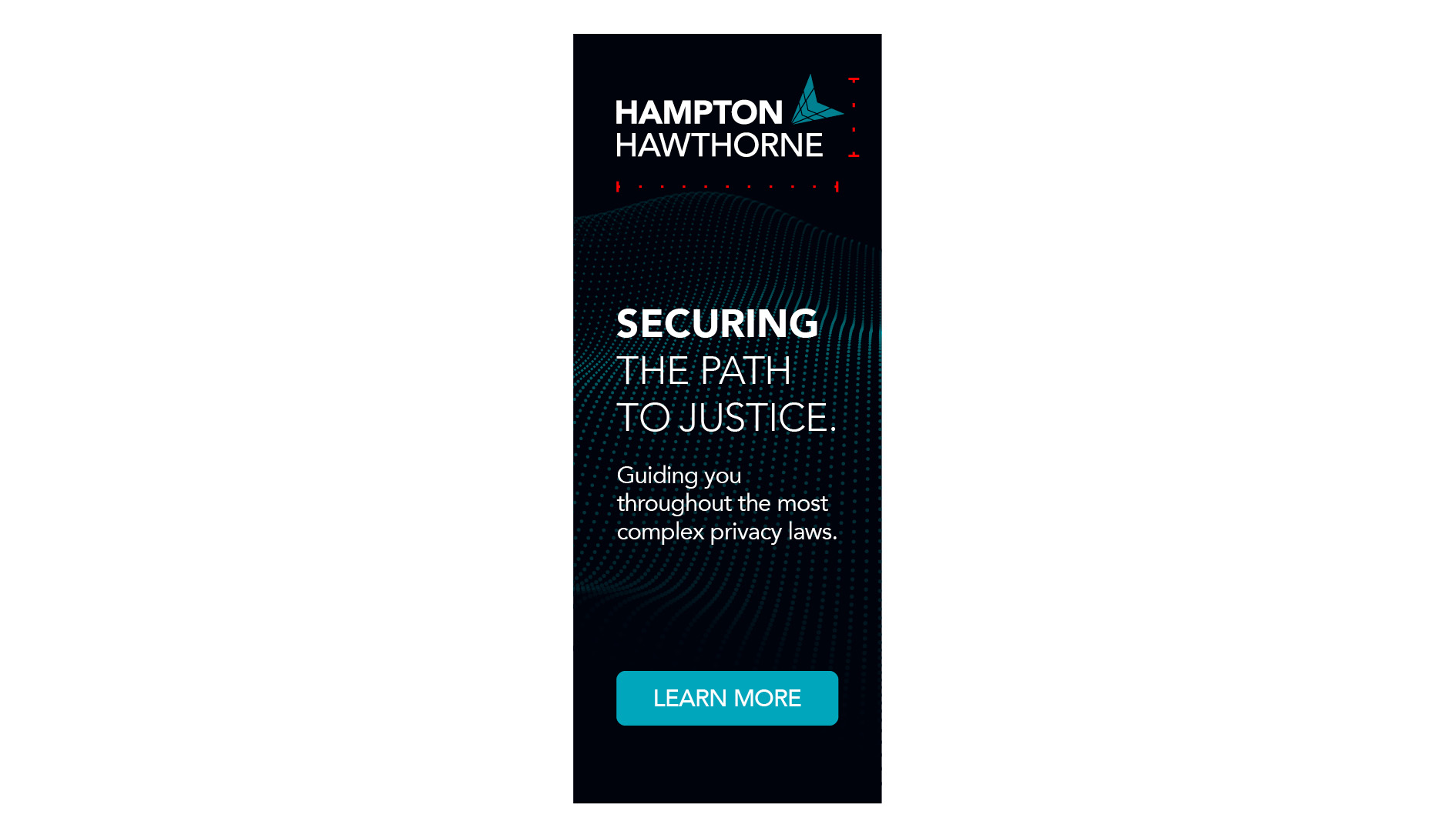
Almost 55% of website traffic is coming from mobile devices this year, which proves the need to have a more condensed logo that can fit on smaller screens. By choosing to not have a narrower version of your logo, you can risk losing valuable identity presentation and exposure by having to shrink your horizontal logo so much that it becomes less visible in smaller marketing materials and ads, especially on mobile devices.
Logomark Only
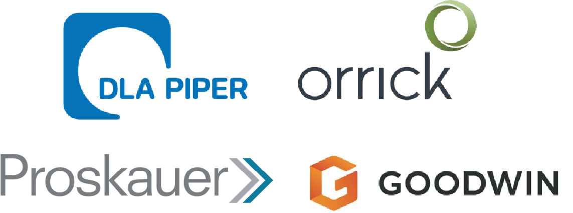
A logomark is the part of your logo that isn’t a recognizable type of some kind; it’s the symbol or icon that represents your brand and may already be included as part of the logo. Some recognizable firms that use logomarks include: DLA Piper, Goodwin, Orrick, and Proskauer. If you look at the marketing materials these companies produce, many times they aren’t using their full logo, but rather they are using their logomark, whether as a design accent or marker of some kind.
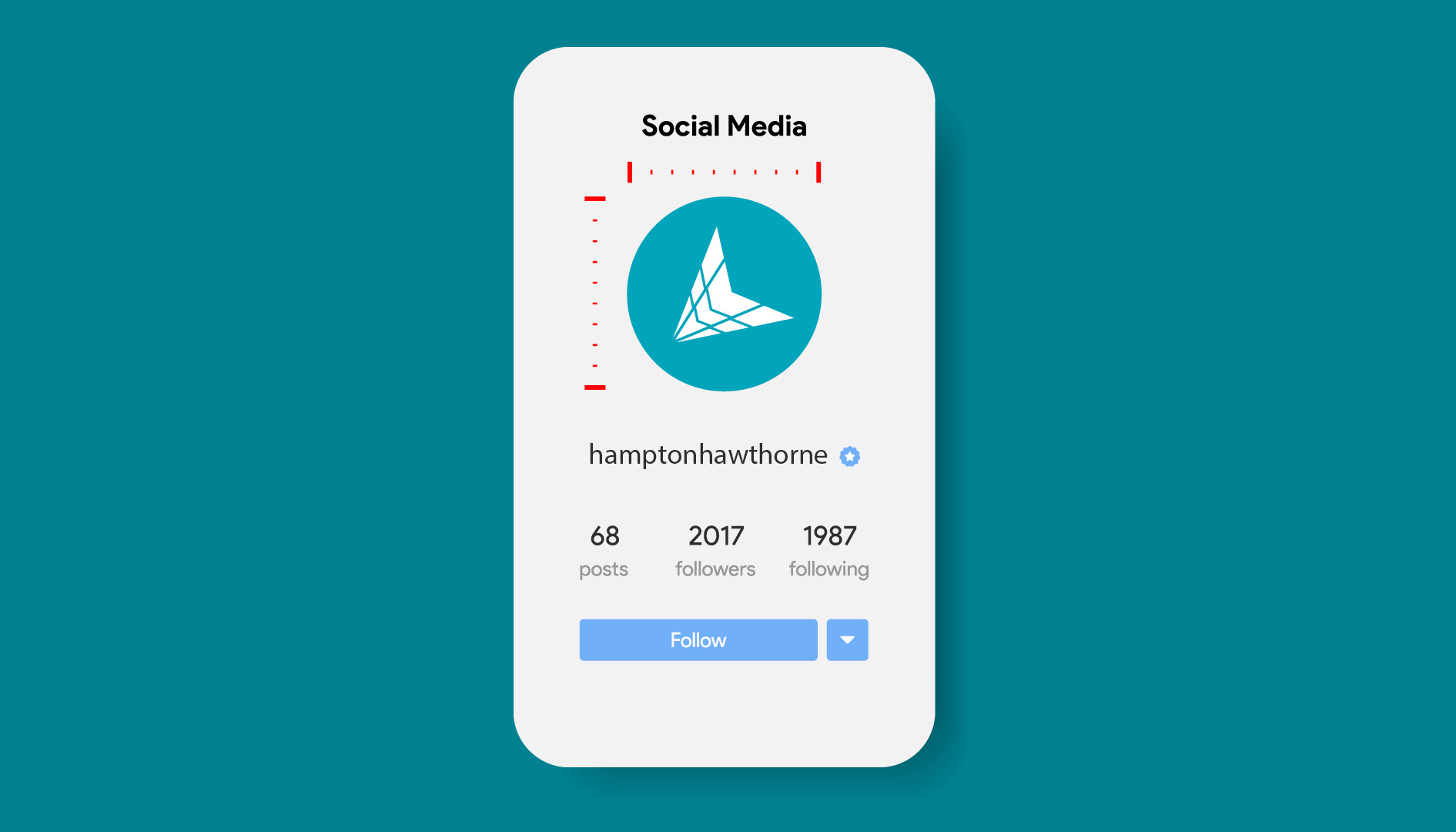
 These logomarks enhance a brand and provide even more options for creating a strong visual identity. A logomark, however, isn’t just used to give your brand more visual interest, but rather it should be simple and memorable enough that it can be used alone and still make a brand statement. For example, an icon can be used throughout your website as a design marker, as a pattern for things such as Zoom backgrounds or on in-house or giveaway merch and marketing/swag materials. Not only this, but it works to fit in spaces where no type can fit at all or where the full logo may be visually overbearing, such as social media profile images, website footers, loading pages and brand merch.
If you have a logotype/wordmark only (or a logo that consists only of type) and you want to also include a symbol that represents your brand, you could also choose to have a shortened or initialed version of your logo, rather than an “abstract” symbol. However, you need to be mindful of how the market refers to the firm and consider whether the promotion of firm initials could lead to brand confusion in how the firm’s name is presented.
Logotype Only
Similar to how your logomark should be able to stand on its own, you should also have the logotype/wordmark capable of being its own as well.
Sometimes the full logo and logomark can be a bit much when together, especially when size is an issue, or there is going to be a lot of logo repetition on marketing materials. Cutting out your logomark should not have a huge negative impact on your logo design though. If it is, and your logo loses visual value and uniqueness, then you should rethink the design aspects of your logotype. A strong logo should not depend upon abstract symbols to make it feel great; rather it should already be great, and the mark only serves as an enhancement.
Again, there are brand materials, especially in-house ones, that won’t require as much push for awareness (because people at your company should already know who you are). Especially in formal documents, such as annual reports, multipage documents, secondary pages, or anything that is going to carry a repeating heading or footer, the full logo might become a bit tiring to see every time you turn the page. A simple logotype keeps your brand on the page, but in a much more toned-down way.
 As you can see there really isn’t a “one size fits all” logo format, especially for businesses when there are multiple names attached to a logo. With media variety, you’ll want to invest in having multiple variations of your logo layout to get the most effective brand executions possible. While a horizontal layout is typically the most important, the vertical version of your logo is a close second; you want to make sure your mobile users can easily read and identify your logo. Having a separate logomark and logotype might seem like a visual divorce, but it allows each to become a brand statement of its own, making your firm seem more advanced and well-established as other larger competitors in the market.
The need for a logo suite isn’t just technical, but practical. Having a variety of options to choose from can help you determine the best way to display your most important brand identity asset and launch you ahead of the game with a responsive layout for any situation.
Need help creating, developing, or expanding your logo suite? Contact our Chief Business Development Officer, John Albert, at john@herrmann.com to see how Herrmann can help your firm’s logo today.