
A Picture's Worth a Thousand Words
Which attorney bio photography style is best for your firm?

Attorney bios are arguably the most important pages on law firm websites. They are typically the most viewed pages on a site and serve as that initial introduction point between your firm and a prospective client. Legal professionals need bios that offer an authentic view into their capabilities as well as capture their personalities in a holistic way. They serve as that initial handshake. Being the first thing on the page that someone will likely see, the bio photo style on your website has an outsized impact when it comes to forming that initial impression of an attorney in the viewer’s mind.
While the trend in bio photography has moved towards bigger, wider and more personal imagery, there are still multiple styles you could potentially choose from to achieve your desired tone. Each can be effective, but each comes with its own challenges to consider as well.
Environmental
With an environmental portrait style, a firm can showcase their beautiful office space if they have one, or a nice, blurry background can be dropped in using chroma key (green screen) technology. For larger firms or firms with a big office space, several locations may be used or even multiple offices using the same shooting style. For Post & Schell, we had the same photographer travel to different offices to achieve a consistent look across offices.


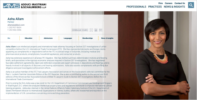
For Nixon Vanderhye and Adduci Mastriani & Schaumberg, their single offices provided several large spaces to shoot different backgrounds.


For smaller firms, sometimes office space is too limited to achieve a nice background. Or, maybe a firm wants a consistent background for all their attorneys without the hassle or cost of a large production. In that case, attorneys can be photographed on a white background or green screen and dropped onto a background. We used this method for both Maron Marvel and Krieg DeVault.


While environmental can be beautiful, be aware of the limitations. For one, if text is used on top of the image, as is often the case, you may need to keep in mind whether the background needs to be light or dark to allow enough contrast from the text. In the Post & Schell examples above, we chose to fade out the image on the left side to make the text more readable. Another limitation to consider is the proportion of the image. As an image gets wider, the shallow depth of field (background blurriness) becomes more challenging. So if you want a blurry background in a wide format, you may need to go the green screen route.
Solid Background
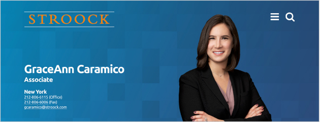
Offering plenty of design flexibility, a solid color, black or white background can have just as much pop and personality as environmental. With nothing in the background to distract from the subject, the focus is entirely on the attorney. For Stroock, we silhouetted each person and placed them on a graphic background.
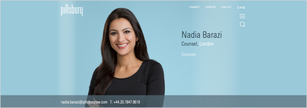
Looking at websites designed by others, we admire Pillsbury’s usage of bright blue in the background. These portraits were shot by Gittings Legal using chroma key technology.
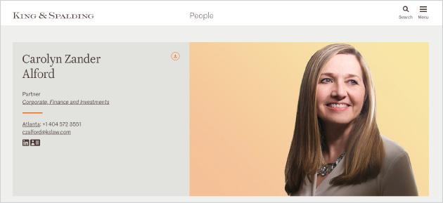
King & Spalding is another example that uses silhouetted people on a color background. To stand out, they use a shorter box instead of spanning the page and some of their people are looking away from the camera.
Black & White
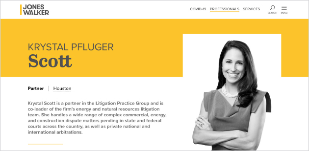
Black & white photography is a sophisticated and elegant style that portrays confidence and allows a subject’s personality to shine through. It’s timeless and classic, yet when used with a high-contrast style, can look modern and striking. Lighting and shadows can be used to add interest to the photograph. In the absence of color, photographs can be more flattering by hiding details, and at the same time convey emotion. For Jones Walker, we utilized black & white photos combined with their bright yellow as a key element in how the firm’s brand was projected. Jones Walker’s use of photography mirrors the firm’s duality in a manner that is both bold and dynamic. The brand’s use of yellow complement their high-contrast, black & white bio photos. The result salutes Jones Walker’s traditional values while showcasing their creativity, sophistication, and entrepreneurial spirit.
Cropping is another consideration. The majority of firms show a full head down to mid-chest level. To stand out, a different cropping such as full body could be used. This is great for showcasing personality, but most people are uncomfortable being shot this way. Another different cropping is the extreme zoom – another way to stand out, but again, as people’s faces get larger, more detail is visible and not everyone is comfortable being large on a screen.
Choosing a bio style can set the tone for your website and, by proxy, your firm’s brand. Your attorneys are your brand – this is still a relationship-driven business – so the style of your bio photography reflects on your firm’s approach to the law and its work product. If, for example, your client service approach is a key differentiator, then a more relaxed, friendly and approachable tone may be desired, which could be achieved through any of these styles. Or, for litigators who want to appear tough and steadfast, the stark black & white or solid background would be better choices than environmental. When redesigning your website or refreshing your bios, start by figuring out what implicit message you want to convey and then choose the photography approach that best supports those goals.
Do you firm's bio pages need a makeover? If so, contact Herrmann’s Chief Business Development Officer John Albert today at john@herrmann.com to see how Herrmann can effectively capture your firm's desired brand and positioning through your bio pages.